Squarespace is one of the fastest-growing and one of the best website builders in the industry.
It’s easy to use and powerful enough so that it can serve both simple and more advanced types of websites, such as online stores.
We’ll show you how to use Squarespace for creating a functional and beautiful website that your visitors will love.
The tutorial includes sections on picking a template (design), how to customize your site, how to create content pages, and even how to build an online store with Squarespace’s commerce module.
Let’s get started!
Table of Contents
- Signing up with Squarespace
- Choosing a design
- Setting the main website details
- Customizing logos, fonts, and colors
- Customizing the homepage
- Optimizing your site for mobile
- Creating sub-pages
- Customizing the main menu
- Launching a blog
- Launching an eCommerce store
- Understanding the main Squarespace dashboard
- Extending your Squarespace website
- Launching your Squarespace site to the public
- Video Tutorial
1) Go to Squarespace.com And Get Started
Getting your Squarespace adventure started is very straightforward.
Visit the main page at Squarespace.com and click on the Get Started button in the top right corner.
This will take you straight to the design screen.
2) Choose a Website Design
Squarespace has some modern and beautiful website templates that you can choose from. There are no designs paid extra – every template is included in your standard Squarespace membership.

You’ll notice that Squarespace has its template catalog neatly organized by the niche/purpose of the website.
Looking through the list of popular designs is a great starting point – those designs are popular for a reason. And, of course, if you see your niche on the list in the sidebar, make sure to look through those designs as well.
One note; if you’re going to be building an online store, check out the Online Stores category of templates. Those are the templates that have been optimized specifically to work for eCommerce.
Before committing to any template, you can preview what it’s going to look like with some demo content. For that, hover your mouse over the template to see the preview link.
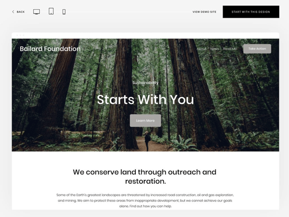
Once you’ve found your perfect website design, click on start with this design to have it imported to your site.
At this stage, Squarespace will ask you to create an account. You can sign up using Gmail, Apple, or another email.
3) Enter the Main Website Details
From this point on, Squarespace will take you by the hand through the entire process of having your website created.

The first step is to enter your website title. Once you do that, Squarespace will show you how to handle the most important tasks around your site, such as editing pages, creating new ones, and styling them.

4) Customize Your Logos, Fonts, and Colors
This is usually the first step on your path to making the site truly yours.
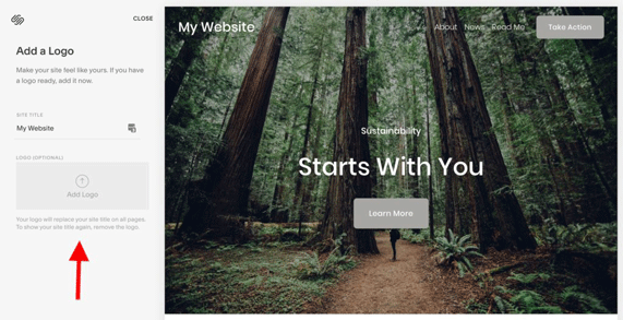 Note: don’t mind the demo images and texts that you can see on your site at this stage. You’ll be able to change them later on.
Adding your logo is quite straightforward – just upload the logo file and see it appear on the canvas immediately.
If you don’t have a logo yet, Squarespace will help you get one created in no time. There’s actually a separate Squarespace logo maker tool. It has a basic set of editing features, plus some stock icons that you can add to your logo.

You can save your logo from that tool and then upload it to the main Squarespace website editor. (Alternatively, you can also use any of these logo maker tools.)
As soon as you upload the logo, you’ll see it on the canvas.

Click on Next to proceed to fonts.
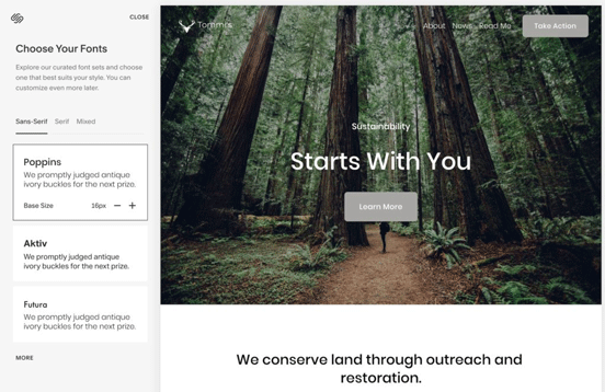
Customizing the website fonts is even easier than adding a logo. Instead of giving you an endless list of individual fonts, Squarespace shows specific font pairings that are guaranteed to go well together.
All you have to do is decide whether you want to go with sans-serif, serif, or mixed fonts.
As soon as you click on any font pairing, you’ll see it in the preview section. You can also adjust the base font size (the standard size of all paragraphs of text). Changing this size will have an impact on all the other texts on your site, such as headings – since those are traditionally scaled-up versions of the base size.
Once you’ve found your perfect font pairing, click on Next to proceed to colors.
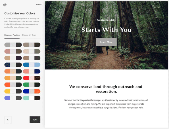
In terms of simplicity, color settings are similar to font settings. Instead of having to pick your colors individually one by one, you can choose from a set of designer palettes. In short, a color palette is a set of colors that match. Using a palette put together by a professional designer is an excellent shortcut to guaranteeing that everything will fit.
You’ll notice that Squarespace presents its palettes as groupings of three colors. You can think of these colors as:
- The primary color (for links, buttons, other elements that stand out on the page)
- The background-color
- The secondary color (secondary backgrounds, links, etc.)
As with everything else so far, select the color palette that looks the best for what your needs are. Alternatively, if you’re feeling super confident, you can put together a custom palette.
Click on Done to finalize this part of the website setup.
You’ll see your logo, fonts, and color selections added to the site.
5) Customize Your Homepage
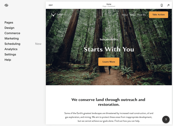
Now is a good moment to customize your homepage and replace the demo content with your own. To begin, click on the Edit button that’s in the top bar of the canvas.
You will be taken to a visual website editor where you can modify any element that’s currently on the page, delete elements, and also add new ones.
Here are the basics of working with this builder tool:
Looking Through the Available Options
Squarespace divides all content on your pages into separate rows. Here’s an example homepage design:

From the top:
- The menu row,
- The hero section row (with the image and the headline on top),
- The text section row (starting with “We conserve…”).
Each of these rows has different options and customizations available. To see what you can do, simply hover your mouse over any element on the page, and see what options pop up.
For example, when you hover over the menu bar, you’ll see a button inviting you to edit the contents of the bar.

Clicking on this button will show a range of options, such as changing the layout of the header, replacing the logo, adding extra elements, and more.

In a similar fashion, you can hover over any other element to see the options available.
Further, to edit any text that’s on the page, just click into it. A simple text editing section will appear. Here’s what happens when we click into the current headline:

What’s cool about this interface is that you don’t have to be looking for any “save” button anywhere. Any text you add/edit will be saved automatically.
Here’s what else you can do within this interface:
Deleting Elements
Any individual element or even a whole row can be removed from the page easily.
Hover your mouse over the thing that you want to delete and click on the trash can icon.

Accessing Option Panels of Elements
Most elements that are part of your website design come with their own options panels.
To access one of those panels, click on the pencil icon that’s usually in the upper right corner of the element in question. Here it is for the main hero section on our homepage:

Clicking on that icon will reveal a set of additional options for the hero section.

Every element has a slightly different set of options, but you can generally expect to see adjustments for formatting, backgrounds, colors, alignment, and more.
Also, it’s not only sections/rows that have their options, but some individual elements have their own options as well. For example, if you click on a pencil icon next to an image block, you’ll see this:

We encourage you to experiment with these settings, click around, and see the effect this has on your design.
Realigning the Sections
Squarespace lets you drag around individual elements and drop them into some other place.

You have full freedom as to what element you want to grab onto and where you want to put it.
Additionally, to make moving sections up and down a bit simpler, you can take advantage of the arrow buttons that you can see in the top right corner of any given row:

When you click on either of them, you’ll see your section switching places in real-time.
Adding New Sections
Apart from working on the sections that are already in your design, you’ll also want to add new sections to accommodate whatever content you want to include on your pages.
To add a section, click on any of the “+” buttons you can see throughout the page.

These plus buttons come before and after every content section. This makes adding new content quite easy. Just pick the spot where you want your new section and click on the corresponding “+” button.
Once you do that, you’ll see a new window where you can pick from Squarespace’s vast library of content sections and elements. Everything is grouped into categories, so you can quickly find any type of section you need.

There are standard content sections for things like headlines, galleries, images, quotes, blocks of text, but also more specialized ones for appointments, donation info, newsletters, reservations, FAQs, pricing blocks, restaurant menus, and more.

Once you’ve found a section you like, click on it to have it imported to your page.
To make customizing the new section easier, Squarespace fills it with some demo content. For example, if we add a menu for our fictional restaurant, there are going to be some example dishes in it already.

Now all you have to do is replace this demo content with your own. The process is the same for any other type of section you might want to add to the page.
Adding Images and Other Visual Elements
Images, videos, and other visuals are some of the most important content types on most websites nowadays. Squarespace is ready to handle them and lets you add any kind of media you might need on your website.
As we’ve covered above, to add new content to your site, you’re going to do it by clicking on the “+” button next to where you want to place that content. Then, pick a specific content type from the catalog – in this case, an image or a video.
Squarespace has templates for image gallery blocks, single images, single videos, music, and even charts. For example, if you click on Images, you’ll see a selection of different layouts for effective image presentation.

Clicking on any of them will add an example image to your page. You can naturally replace these demo images with your own. To do so, click on the pencil icon next to the image you want to replace, and then on the trash can icon.

You’ll see the image clear and a new section appear, indicating that you can upload an original image.

At this stage, you can just pick an image from your computer and have it imported.

This is not where the functionality ends. Squarespace also has some pro tools that allow you to edit your image and change some of its parameters. Click on the Image Editor button to begin. Here’s what you’ll see:

Some of the actions you can perform include:
- Setting the brightness of the image, contrast, saturation, blur, etc.
- Cropping
- Flipping the image
- Changing the aspect ratio
- Adding filters
About that last thing, yes, Squarespace has Instagram-like filters that you can apply to any of your images!
When you’re done with basic image editing, you can switch to the Design tab of the image options popup. This is where you can change the style of the image block, enable a lightbox, or add a custom link to the image.
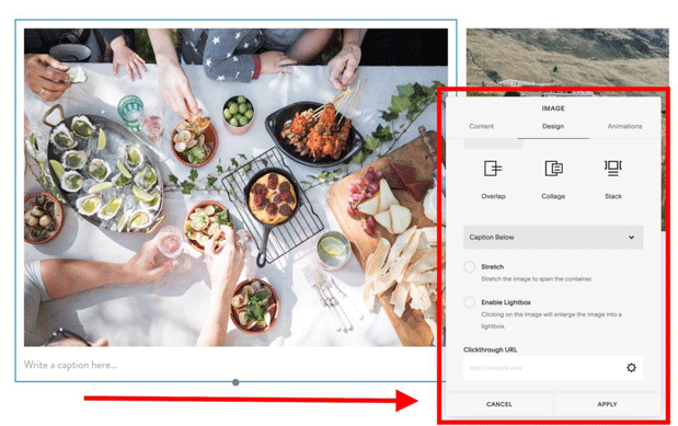
There’s also the final tab – Animations – which lets you set the image to not just sit there but appear with a fade-in, tilt-up, tilt-down, plus a couple of other cool effects.
Overall, Squarespace is rather impressive when it comes to the number of tweaks it lets you do to your images. For simpler applications, you can get away with using just Squarespace for image editing and forget about more advanced tools like Photoshop.
Adding other types of visual content works just like adding images. For example, to add a video, first, click on the “+” icon next to where you want to place it. Then, pick a video block from the list. Lastly, replace the demo video with your own.

6) See Your Design on Mobile
Most users don’t think about mobile too much when working on their websites. However, as it turns out, mobile traffic is snowballing – it went up more than 200% in the last seven years. Moreover, casual users are more likely to visit your website from a mobile device than from a desktop or laptop.
Getting a website optimized for mobile used to be a pain.
Back in the day (and with some website tools even today), the only way to make a site work on mobile was to write device-specific code by hand. Not only that, but you also had to account for all kinds of different screen sizes and device types.
Luckily, this is not a problem with Squarespace at all. With some clever mechanism, Squarespace is able to predict what the best mobile layout for your website design will be and then serves it to your mobile visitors automatically. In other words, you don’t have to worry about mobile at all if you’re building your site with Squarespace.
What you can check out, however, is the mobile preview of your site. You can access it by clicking on the mobile phone icon that’s in the top right corner of the Squarespace interface.

Squarespace doesn’t only narrow down the viewport by squishing your content together but also realigns your columns so that they render in the right order on mobile. It also makes sure that all your custom elements such as forms, reservation and appointment blocks, etc., function correctly for your mobile visitors.
7) Create Sub-Pages
Most users will want to build more pages than just the homepage. Here are some examples of sub-pages that you can make use of:
- About page and/or Team page
- Contact page
- Privacy Policy and Terms of Service
To add a new page, go back to the main Squarespace dashboard, and click on Pages.

Next, click on the “+” button.

You’ll be able to pick from a blank page template, one of the pre-designed page layouts, or add a page that’s actually a collection of other content items (more on that later).
Let’s proceed by clicking on Page Layouts. Just like with content types, Squarespace has a catalog of pre-made designs for you here as well.

This couldn’t be simpler; pick the category of the page that you want to build and then select a specific page layout.
Right after you take your pick, you’ll see the page template imported to the canvas. You can edit this new page just like you edited your homepage.

As you saw in one of the screenshots above, Squarespace has templates for most of the standard types of pages that you might need. However, if by some chance your ideal page is not on the list, you can:
- Either add the General page and modify it (the easy path) or;
- Add a Blank page and build it from scratch by adding individual content elements to it (the slightly more time-consuming path).
As a side note, it’s great that Squarespace will help you out with demo pages for things like privacy policy and terms of service as well. This is not always something you find with other website tools.
A Word on Contact Pages
Squarespace allows you to include a live contact form on your contact page. That form will take the messages that your visitors enter and send them to a location specified by you. Here’s how to set this up:
First, you have to add a contact form to your page. As usual, this is done by clicking on one of the “+” buttons and then picking a form design that you like.
Next, click on the pencil icon next to the form. You’ll see the following customization popup:

You can do a couple of things here in the individual tabs:
- The Build tab. This is where you can add new fields to the form and/or remove any of the current ones. You can also edit their labels and add descriptions if you want them.
- The Storage tab. This is the most interesting tab. It’s where you get to decide what you want to do with the entries that people are sending your way. You can have them be forwarded to your email address (the simplest solution), or have everything integrated with a third-party newsletter tool like Mailchimp, Zapier, or Google Drive.
- The Advanced tab. This is where you can set things like what it should say on the send button, what the post-submit success message should be, and so on.
When you’re done customizing these settings, don’t forget to click on the Apply button to save the changes. Once you do this, your form will be fully operational.
8) Customize Your Main Menu
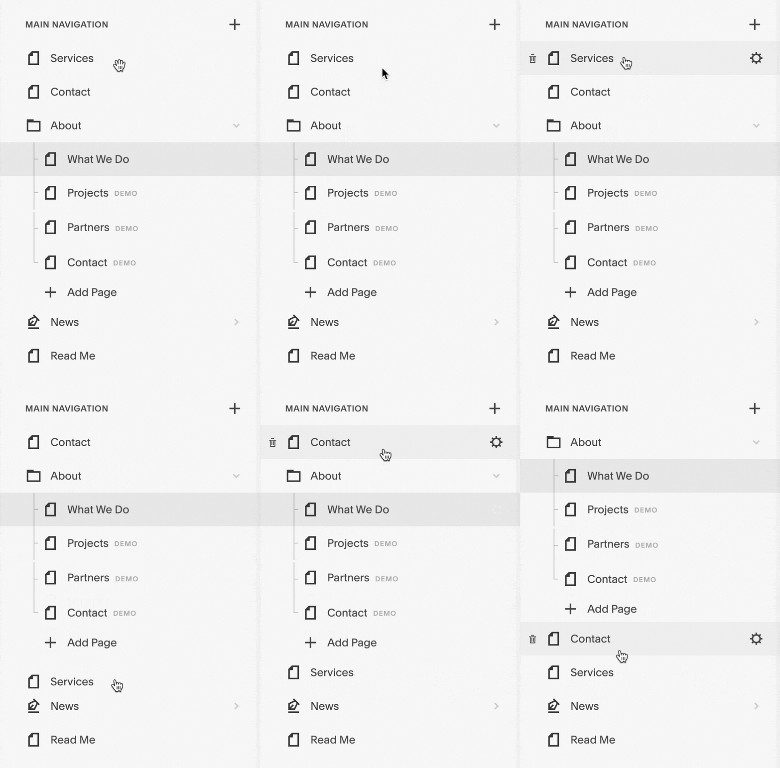
Squarespace does a pretty good job of adding every new page to the main menu of your site, but we can still tweak things to make the menu look 100% perfect.
To customize your menu, go back to the main Squarespace dashboard again, and click on Pages. From there, you can grab any of the page links in the sidebar and drag them up and down.
9) Add a Blog (Optional)
A blog can be a great tool in helping you reach new audiences, users, or customers, depending on what the purpose of your website is.
You can also use the blog for things like company news or industry news, and not as much for publishing classic blog posts. It’s all up to you.
Squarespace makes creating a blog easy – which is kind of the norm with them, as you may have noticed.
Actually, depending on the specific website template that you chose when first getting started working on your site, you might already have a blog module present.
If not, you can add it by going to the Squarespace dashboard and clicking on Pages. Then, click on the “+” button in the sidebar to add a new page. From the list, select Blog.

Just like with any other page, click on the layout that you like, and you’ll have it imported to your site.
You’ll see that the blog page is a bit different from the standard pages on your site. Instead of being just one page, it’s a collection of other content pieces – in this case, blog posts.

To add a new blog post, click on the main “+” icon. Similarly, you can edit any of the existing demo posts that Squarespace imported for you.
As soon as you click on a post or add a new one, you’ll see the editing screen.

It has all the standard text editing tools you might need, and you can also add images and other media to your posts.
When you’re done working on the post, click on Done (upper left corner), and pick if you want the post published right away or scheduled for a later time.
10) Add an Online Store (Optional)
The great thing about Squarespace is that it can be used not only for simple business card websites but also for full-blown online commerce operations with various features.
One of the main things people like to build these days is an online store – aka. an eCommerce store. Squarespace can handle the task with ease.
The commerce module at Squarespace allows you to add all different kinds of products to your store, handle incoming orders, track them, set shipping details, accept online payments, keep inventory, and give your customers access to a simplified payment and checkout process. In short, it’s the full package of online commerce!
Squarespace also doesn’t limit you in terms of what you can sell in your store. No matter if it’s products, services, downloads, or whatever else it might be, Squarespace has you covered.
Creating an Online Store with Squarespace
Your adventure with eCommerce in Squarespace starts by adding a new page that will serve as the central catalog of your store. To do that, go to the Squarespace dashboard, click on Pages, and then on the “+” button to add a new page. From the list, select Store.

Pick a template that you like by clicking on it. Squarespace will add a couple of example products to the catalog just to give you an idea of what it’s going to look like.
You can edit the design of this page just like you can edit any other page’s design in Squarespace. Click on the Edit link that’s in the top left corner of the page.

To edit what your product catalog looks like, click on the pencil icon next to it. From there, you can control the basic parameters of the block, change the fonts, spacings, colors, etc.

The most straightforward method to manage products (edit them, add new ones) is to come back to the main Squarespace dashboard and go into Commerce → Inventory. You’ll see a list of all your products there. Clicking on any of them will bring up the editing screen.

From the same page, you can also add new products, import a list of products, and edit your products in bulk.
If you take a look at what else is there in the menu of the Commerce section in Squarespace, you’ll see a whole range of cool features that can come in handy as you work with your store day-to-day.

Some more notable sections:
- Customers – browse through your past customers and their orders
- Discounts – create new discount codes, activate them at certain times
- Point of Sale – use Squarespace commerce tools in your storefront
- Payments – set up new payment methods
- Checkout – customize the checkout sequence to fit your business
We encourage you to browse through each of the sections available in the Commerce panel and see what they can bring to the table.
Even if you don’t want to configure anything extra there, you can at least take advantage of Squarespace’s Accounting and Taxes sections, where you can export your store’s crucial financial numbers.
11) Get to Know the Main Squarespace Dashboard
We’ve been working with website builders like Squarespace and its competitors for a while now, and we have to admit that Squarespace stands out when it comes to the overall dashboard quality and ease of use.
Everything is straightforward here, and you can get to the exact option you need very quickly.

So far, in this guide, we’ve spent most of our time in the Pages and Commerce sections, but there’s a lot more to examine if you really want to get the most out of your Squarespace experience.
For example, if you want to fine-tune the way your website looks, go into the Design section.

Each of the links you see in the sidebar leads to a separate sub-section where you can tweak various aspects of the site’s design.
For example, when you go into Animations, you’ll see some handy controls that are responsible for how your website elements appear on the page.

In Buttons, you can change what all buttons on your site look like, set their shape, rounded corners, and so on.
There’s a lot more there, but what’s important is that all of it is easy to use and doesn’t require any coding skills or web development experience.
Other main sections, like Marketing and Analytics, allow you to have a really detailed look into how your website is performing and how your visitors see it. Having this sort of insight can be invaluable to your business in the long run.
Squarespace Website Settings
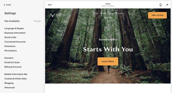
One more section of the dashboard where you should spend a couple of minutes are the main settings. This is where you can make sure that all the details like site language and region, your business information, social media links, and so on, are set correctly.
Squarespace fetches this data in a number of places around the site, so you don’t want them misrepresenting you.
12) Extend Your Squarespace Website
Squarespace already comes with an extensive catalog of features and abilities that will be enough for 90% of users. However, if you ever want to extend your site with some third-party integrations, Squarespace supports those as well.
There are loads of extensions that you can add to your site with a mere couple of clicks. For example, you can integrate Squarespace with your preferred accounting software, your fulfillment center software, or an email marketing tool.
If you do want to install any of them on your site, click on the extension, and then connect to the site.

13) Launch Your Squarespace Site to the Public
At this stage, your Squarespace website is private and not visible to the outside world. To make it public, you need to activate it.
Go to the Squarespace dashboard, and into Settings. Click on Site Availability.
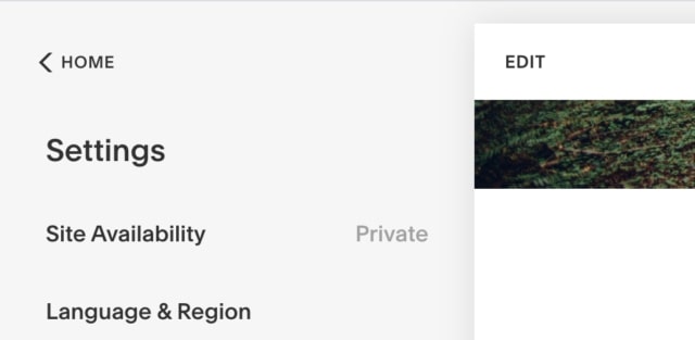
To complete the launch process, you’ll have to upgrade to one of Squarespace’s paid plans.
Here’s the current pricing:

TL;DR
- If you’ve built only a simple website, you can stick with the cheapest plan at $12 a month.
- To run an eCommerce store, you’ll need either Business or Commerce plans. The former of which has a 3% transaction fee, the latter doesn’t have any.
All plans are paid for annually. You can pay monthly, but it will bump the price up by 30%.
All Squarespace plans come with a free domain name.
As soon as you pick your plan and complete the purchase, your site will come online and be available to the public!
Done!
That is it! You’ve just learned how to build a website with Squarespace all on your own.
What’s particularly impressive about this whole project is that the website isn’t in any way lacking compared to what a professional designer would build for you for thousands of dollars. This is the true power of DIY tools like Squarespace.
If you have any questions, feel free to fire away in the comments below.

0 comments