Hi, and welcome to the createawebsitenow.com style guide!
We are really happy that you are part of the writing team and want to learn more about how we do things around here.
To ensure a smooth work process and understand what is expected of you, please read the guidelines below carefully. If you have any questions or need clarification for anything mentioned here, please don’t hesitate to get in touch via info@createawebsitenow.com.
How to pitch your ideas?
We only accept long-form (4000+ words) content from experts (web developers, designers and WordPress developers). All of your hard work will be compensated. If you wish to write for CreateaWebsiteNow.com (non-SEO purposes only), please send us a few ideas via email – info@createawebsitenow.com and we go from there.
1. Blogging Philosophy
Our main goal is to help other people build and run successful websites, blogs, and/or online shops. We are especially focused on beginners without any or little knowledge. However, our audience also consists of more advanced users who already possess skills in the area of web design and development.
Here are the main goals we pursue with the content we create for them:
- Help our readers choose the right tools and platforms to achieve their goals
- Produce one-stop, evergreen content that they will be happy to bookmark, refer back, and link to over and over again
- Use clarity, simplicity, and straightforwardness as the most important guiding principles for our online content
- Focus on creating as much value as possible by providing accurate, up-to-date information backed up by data
- Create resources that users walk away from feeling like they need nothing else on the topic
2. Preparing for an Assignment
When preparing for an assignment, plan the post so that a reader with little or no knowledge about the topic will, after reading it, feel competent in taking the necessary steps to achieve their goals or solve their problems.
Think through the post from the perspective of a prospective reader.
- What questions would they have?
- What information are they looking for?
Plan the post so that anyone who reads it walks away completely satisfied and with all of their most important questions answered. Doing some keyword research helps as well as looking into search intent and reading existing posts on createawebsitenow.com. You can find all of our guides and tutorials here.
3. Editorial Workflow
Our workflow for creating posts is as follows:
- Proposing topics
- Creating an outline and the structure of an agreed post
- Outline approval and agreeing on a deadline
- Research and writing
- Editing, proofreading, and publishing
You will be in touch with one of our editors throughout the entire process who will go into detail about how to tackle each step.
4. Writing the Post
What follows are a number of important things to keep in mind when you get down to writing the post.
4.1 Language
Here are some general rules for the use of language in blog posts:
- Use American English – All content should be written in American English. If you are unclear about this, look at this resource to understand some of the differences between British and American English.
- Address the reader in the second person – Always talk to the reader directly like you are having a conversation with a friend. Avoid generalizing phrases like “one would/can”. Remember, you are trying to solve a problem for the reader, so talk to them.
- Bad example: When someone makes a website, most times, it’s created for a particular audience that they are trying to attract
- Better example: When you are creating a website, most times, you are trying to attract a particular audience.
- Speak on behalf of createawebsitenow.com using the first person plural – This means, always speak as “us, our, we” and not “I, my, mine”.
- Keep it simple – Clarity is key. Avoid overly complicated words, explain things in a way that even beginners, non-native speakers, and people of different ages, gender, and geolocations would be able to use the content of the post to their benefit. This also means, streamline your language as much as you can. If you can leave out a word, you probably should.
- Bad example: Doing so can cause your site to experience a reduction in search rankings.
- Better example: Doing so can hurt your search rankings.
- Examples of words to avoid: omit, opaque, idiom, serendipity
- Examples of more common words: exclude, nontransparent, expression, chance
- Stay away from passive voice – Use active voice as much as possible. Some passive voice is fine as a stylistic device, but whenever possible, go active.
- Bad example: Roboto is used by 3 billion people
- Better example: 3 billion people use Roboto.
- Numbers – Spell out numbers from one to twelve but use the numericals for anything higher than that. The exception are post titles and headings like The Top 8 WordPress Translation Plugins.
- Bad example: There are 2 main factors that influence time on site.
- Better example: There are two main factors that influence time on site.
- Use of “ “ – Use quotation marks (“ “) only for direct quotes, to introduce technical terms, and convey irony or sarcasm.
- Example: “There is no reason anyone would want a computer in their home,” Ken Olson said way back in 1977.
- Example: For that, you might use a CDN or “Content Delivery Network”.
- Example: Leaving your WordPress site unprotected is a “brilliant” idea.
- Proofread! – Grammar and spelling mistakes look unprofessional. Therefore, please proofread your post thoroughly. Use a tool like Grammarly if you are unsure about your proofreading abilities.
4.2 Use Up-to-date Information
Always make sure to use the latest information you can find. That means if you include research, stats, and numbers, try to find the most current.
Likewise, if you are using screenshots of software or software components, be sure to use the latest version. A good example for that are WordPress themes. If you are going to include theme screenshots, make sure to use the latest WordPress default theme or something else that is up to date.
4.3 Headlines
The final headline of the post will be determined during proofreading and editing. However, feel free to propose a title if you have a great idea. Otherwise, you may also just leave it as the main keyword. More information on how to write great blog headlines here.
4.4 Introductions
The point of the introduction is to get visitors to read the rest of the post. For that, they need to understand what’s in it for them, so they can decide whether it is worth their time.
It also needs to be short and to the point. On createawebsitenow.com we generally shoot for an introduction length of 110 to 175 words.
Here’s an example of a good intro (Guide: How to use Shopify):

As you can see, it tells people:
- What Shopify is and what you can do with it
- Expenses you can expect
- What you can achieve with this guide
Introductions are most effective if you get to know your audience’s pain points, fears, desires, and problems. That way, you can address their possible objections in the introduction and state what kind of solution the post is going to offer them. Here is an example:

Keep the above in mind when crafting your own introductions.
4.5 Headings
Headings structure the content. They break it down into sections and make it more readable. In addition, headings allow casual readers to scan the post and find only those parts they are interested in. They also provide SEO value.
Here are some important rules for using them:
- Use Title Case – All headings should be in title case (meaning, capitalize the main words, e.g. 10 Best WordPress Plugins for Small Business). Use this tool if you are not sure how to do it correctly.
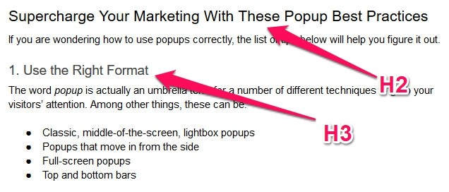
- Stick to H2 and H3 – Use heading 2 (H2) for creating sections in the article and heading 3 (H3) to further divide those sections if necessary. Only rarely does it make sense to use headings of a lower order and H1 is reserved for the page/post title.
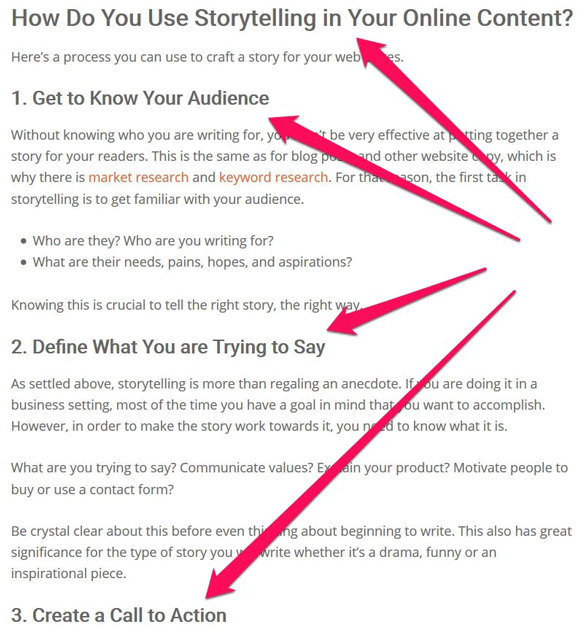
- Subheadings should answer and clarify main headings – When creating subsections for the main section, the subheadings should always refer to the section headings in a logical way. A reader should be able to scan only the headings and understand the structure and main information of the post. If you have steps, use numbers in front of headings.
- Never follow a heading with another – Always make sure to have some body text in between two headings or at least an image.
- Include the key phrase and related keywords – Search engines also care about headings and use them to understand the structure and content of a piece. For that reason, headings are a great place to include your main key phrase as well as related keywords. You can find related keywords at the bottom of Google searches. More on keyword research here.
- Linking from headings – If you want to add a link to a heading (as is very common for lists of themes and plugins), make sure not to include the numbering in it. In addition, make sure to have external links like this open in a new tab (more on that below).
- Bad example: 3. Yoast SEO
- Better example: 3. Yoast SEO
- Headings for conclusions – Conclusion headings are a perfect place to include keywords. Therefore, avoid titling them something like Conclusion, Summing Up, or In Short… Instead, use more engaging copy.
- Example: Final Thoughts: Increasing WordPress Performance
- Example: WordPress Shortcodes in a Nutshell
4.6 Formatting
To ensure readability and a consistent look across the entire website, please adhere to these formatting guidelines:
- Create clear paragraphs – Avoid large chunks of text. Use one paragraph for every idea with one core sentence and additional ones only to clarify. Don’t randomly add line breaks just to create structure. Use transition words to connect paragraphs.
- Ensure readability – Avoid long sentences. Try to use no more than 20 words per sentence. Use mostly simple words, up to three syllables. Again, even newbies, people without prior knowledge on the topic, and non-native speakers should be able to follow the advice.
- Keep it interesting – Vary sentence and paragraph length to keep the language dynamic.
- No extra markup – Don’t add any HTML markup manually (divs, spans, horizontal dividers, etc.). This includes custom styling for headings and other text elements. All of this is the theme’s responsibility. The only time you should ever add markup is to set links to rel=”nofollow”.
- Make use of lists – Avoid creating lists manually by adding 1., 2., etc. or even hyphens in front paragraphs. Instead, make sure to use proper HTML lists (ordered and unordered) like the one you are reading right now.
- Creating lists manually – If you are creating a list by hand (such as a collection of themes or plugins, each with their own H3 heading), make sure to use 1., 2., 3., etc. as the numbering format, not 1), 2), 3) or A), B), C) or similar. If you need to make subpoints, use the format 1.1, 1.2, 1.3, etc.
- Capitalize the first word after a hyphen in a list – If you are creating a list like this one, that has a key phrase plus explanation, be sure to start the explanation with a capital letter.
- Don’t indent – Never use the indent function. Content should only be indented as part of a numbered or unordered list or as a blockquote. In those cases, the formatting is taken care of by the WordPress theme and not part of your duties.
- Italicize menu items and part of the UI – Whenever referring to parts of the user interface such as a menu item to click, make sure to italicize it, including inside headings. If there are several steps, use > between them.
- Example: Next up, click on the big, blue Publish button
- Example: You can find this option under Settings > Reading.
- Set file and folder names in preformatted or Inline Code – When working in WordPress and mentioning file or folder names (such as wp-admin or functions.php), use the preformatted styling (in the Classic editor, use Alt+Shift+X) or Inline Code (choose from the inline formatting options in Gutenberg). This is what it looks like on the page:

- Avoid placing images inside HTML lists – If you create a list, don’t include images in the middle of it (neither numbered nor unnumbered lists). If you feel the need to use images, use paragraphs instead, possibly with H3 headings.
- Don’t use ALL CAPS – There should never be a need to set text in all caps.
- Bolding of text – You can use bolding in your text to further emphasize the steps readers need to take. This, again, is to make scanning the page easier.
- Example: If you include steps, use numbers in front of headings, just like we’ve done on this page.
- Use of blockquotes – There is rarely a need to use blockquotes and you should only do so for including verbatim quotes from other sources. Please do not employ them for asides or emphasis. This is what italics or bolding are for.
- Use of emoticons – If at all possible, please refrain from including emoticons in the content.
If you are working within WordPress, use Yoast SEO. The plugin has an analysis tool for readability.

Make sure the indicator for the finished post is green. If it is not, look at the recommendations it gives and remedy any issues until you have a green light.
(Quick note: When you are using code within an article, due to its repetitive nature, Yoast will often warn you that you have several sentences all beginning with the same word. In those cases, naturally, you do not have to change the code just to get a green light.)
4.7 Links
Links are the currency of the Internet. They show which pages are deemed important and which are not. For that reason, it’s imperative to use them inside your content and do so correctly.
We encourage you to add links to further explain points made in your content and provide proof. For example, if you say that 30% of sites run on WordPress, you need to back this up with facts.
Overall, you should include links to helpful resources where you can. If you mention something that you are not going to explain in the post itself, make sure to point readers to another place where they can learn more about it.

However, don’t stuff your article with links, this is not good user experience.
4.7.1 Linking Correctly
When you do set a link, make sure to do it in an organic way. This means, use appropriate parts of the text to include them.
- Example: For more information on the topic, check this article.
- Example: One of the biggest advantages of digital content is that you can underline the written word with visual data. Whether screenshots, stock photos, gifs, videos or infographics — take your pick.
- Example: A surprisingly large share of daily decisions are made emotionally.
It also means to never include punctuation into your links, only text.
- Bad example: For more information, check this post.
- Bad example: Whether screenshots, stock photos, gifs, videos or infographics — take your pick.
In addition, don’t use the link itself as anchor text.
- Bad example: Follow us on https://www.facebook.com/createawebsitenow.com/.
- Better example: Follow us on our Facebook page.
For guidelines on linking inside headings, please check the Formatting section.
4.7.2 External Links
When you do link to other websites, keep the following in mind:
- Vet who you link to – Make sure to only link to highly reputable sources. This will be easier if you know the big players in the industry. Open every page you link to make sure it is something readers would like to land on when they click. Check the overall design, quality of content, and make sure the site is not spammy or otherwise irrefutable. See that it has last been updated no more than 2.5 years ago. Also, please don’t link to any website you are personally affiliated with to get backlinks.
- Always include clean links – Make sure your links don’t have any extra parameters (as is the case with affiliate links) attached to them. This can happen especially if you copy links from inside other people’s content since many websites link out to their affiliate partners. We don’t want to use those links under any circumstances!
- Bad example: https://themeisle.com/pricing/?discount=affiliate10
- Better example: https://themeisle.com/pricing/
- Bad example: https://www.siteground.com/wordpress-hosting.htm?afcode=fa1fa
- Better example: https://www.siteground.com/wordpress-hosting.htm
- Bad example: https://markmanson.net/5-books-that-explain-why-it-seems-the-world-is-so-fucked?utm_campaign=mmnet-newsletter-201811-12-31&utm_medium=email&utm_source=mmnet-newsletter&utm_content=read-5-books
- Better example: https://markmanson.net/5-books-that-explain-why-it-seems-the-world-is-so-fucked
- Open external links in new tabs – When you link to pages outside of createawebsitenow.com, please set them to open in new tabs (see below for instructions).
- Use the right link ratio – For external links, we shoot for a ratio of 1-3 links per 1,000 words.
4.7.3 Internal Links
For internal links, the rules are a bit simpler:
- Open internal links in the same window – Make sure that the Open in new tab option is not enabled.
- Use the right link ratio – The link ratio for the internal links is the same as for external with a maximum of six (6) links per article.
By the way, here is where you can set links to open in new tabs or not:

To find prospects for internal linking, see this resource page.
4.8 Using Images
Images and other visuals are an important part of every blog post. They break up the text, make it more pleasant to read, underline points, act as proof for your claims, are an important SEO signal, and overall make online content better.
As a consequence, using visuals is highly encouraged when you create online content. As a rule of thumb, we shoot for 1-8 images per 1,000 words.
However, what’s more, important is to look at images as an important tool to clarify what you are writing about. Place them wherever you feel they help to enhance the user experience either by being helpful or making the post more pleasant to consume.
In addition, all images must be unique (meaning made by you, such as a screenshot), should be placed centered on the page (not aligned to the left or right), and be between 700 and 820px wide. For height recommendations, see the Formatting section.
Another important factor is file size and, thus, file type. In most cases, you should use JPG images (in high-quality settings) as these usually provide the smallest footprint. If you need to have a transparent background, go with PNG.
There is almost never any need to use any other file types unless you go for an animated GIF (which is also encouraged where appropriate). If you need to create a GIF file, a great free tool is ScreenToGif.
4.8.1 Formatting
Here are some important formatting guidelines for images:
- Go rectangular – Unless impossible because of the default formatting (such as infographics or screenshots from mobile phones), always shoot for rectangular images, meaning that the width is greater than the height.

- Try to avoid similar colors – When you are using a screenshot that has a white background, see if you can crop the image so that it has some sort of frame around it. That way, it won’t vanish into the background on createawebsitenow.com.

- Use the right part of the image – Crop images so that their focus is on the important part and there is no extraneous, unnecessary space. If you have Photoshop or some other image processing software, you can further enhance this with overlays or blur.
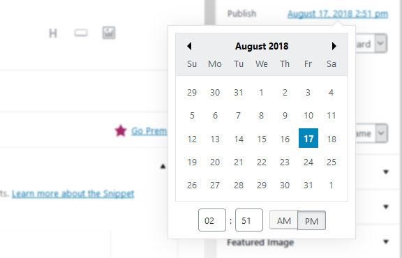
4.8.2 Screenshots
There are many tools to take screenshots. Some of our favorites are Skitch and the built-in screenshot function in Firefox. When you provide screenshots, first of all, pay attention to everything in the Formatting section, especially the part about cropping.
In addition to that, an important topic here is annotation. Use it liberally to clarify steps and help readers find what they are looking for on the screen.

One of the best tools to provide arrows is the aforementioned Skitch. If you have Photoshop, you can also consider blurring parts of the image to provide additional focus as seen above.
Please try to use similar colors for your annotations as on createawebsitenow.com (e.g. blue) unless not permitted by the color scheme of the screenshot. In that case, use whatever color you find appropriate.
4.8.3 Compression
Any image you add to content should be as small as possible. This is an important loading issue since images often make up the bulk of a web page. Besides using the right file type and cropping them to the appropriate size, the most important factor here is image compression. This reduces size without reducing quality.
If you own Photoshop, you can save images in the smallest size possible by using the Save for web function (File > Export > Save for web). Alternatively, there are online tools like TinyPNG/TinyJPG you can use as well as programs to download like ImageOptim for Mac and RIOT for PC.
4.8.4 Plugin and Theme Images
In many cases, it will be appropriate to include images of WordPress plugins and themes. This is especially true for articles that include roundups and lists of the best plugins/themes for X variety.
For plugins, the easiest way is to use the images already present in the WordPress directory.

You can simply access them by right-clicking and choosing View background image. Then, right-click and pick Save image as.
For theme images, try to find or create an image that shows an unobstructed view of the theme. For those in the official directory, you can often simply use the example they provide.

If that isn’t the case (for example, for commercial themes), almost all of them provide live demos you can check. Here, use the browser development tools to delete all elements that obstruct the view of the theme.

Then, use the screenshot tools mentioned above to take a screenshot of the default browser view.

Only include additional images if appropriate, such as when you test a theme in detail and want to show different parts of it.
4.8.5 File Names, Titles, and ALT tags
To help readers and search engines understand what an image is about, it’s important to assign file names that make sense. When they see the name of the file, they should understand what appears in it. Plus, this is also a prime location to include the main keyword of the post.
Example: how-to-install-wordpress-bluehost.jpg
In addition to that, if you are working directly in WordPress, make sure to fill in the image title and ALT tag in the WordPress media library.

This is important for SEO purposes and also for people who can not see the image, such as the visually impaired who use screen readers to surf the web.
WordPress automatically fills in the title with the name of the image file. If you have given your files appropriate labels, it’s enough to simply copy the title and paste it to the ALT tag field.
You can make this work much easier for yourself if you upload files without any hyphens between words. For example, Photoshop automatically adds them when saving for the web. A great tool to reverse this in bulk is the free Bulk Rename Utility.
You can simply open it, navigate to the location of the image files, mark them, and use the replace tool to change all hyphens into spaces.

WordPress will add them back at upload but insert the unhyphenated version in the title field.
4.8.6 Attribution
If you are using an image that belongs to someone else (for example, an infographic or parts of it), always make sure to give attribution to the source.
This can be as part of the text right before the image.

Or as part of the image caption.

Whichever road you take, be sure to include attribution where necessary to avoid copyright conflicts. More information here.
4.9 Including Plugins and Themes
You will likely include links to WordPress plugins and themes in your posts. The goal is to provide readers with the best options to achieve their goals or solve their problems. Therefore, it is important to only recommend WordPress components that fulfill a high standard.
In practical terms that means:
- Rating no less than 4 stars
- Last updated no more than six months ago
- At least 500 active installations (plugins only)
- Tested up to at least the second to last major WordPress version

In short, make sure that any plugin or theme you include is well-rated, up to date, and actively supported.
4.10 Writing Conclusions
Conclusions are basically introductions in reverse order. Their goal is to summarize the post, repeat it in short form and move readers to the next step. Here is the structure:
- Repeat the problem – Quickly repeat the premise for the article
- Summarize actionable steps – Repeat the main points of the post that will help alleviate the problem/desire. If there are additional posts on the site that would make sense to read after this, feel free to include those as well.
- A clear call to action – Include a specific call to action for the reader what to do next. This is usually to leave a comment. When you do ask to comment, make sure to ask for something specific.
- How do you use image captions on your own website? If you have additional tips, let us know in the comment section below!
- What is your opinion on the Gutenberg editor? Are you concerned or excited? Let us know in the comments section below.
- What are your favorite blog post ideas that have worked very well for you? Please let us know in the comments section below.
4.11 Code
There will be times when you need to include code inside blog posts. When you do, please follow these guidelines:
- Make sure to test it thoroughly – There is nothing worse than posting a piece of code that doesn’t work for users. So, don’t just copy and paste it from somewhere else but make sure to test that it actually works. One of the best ways for that is to create a local test website.
- Customize it for the use case – When taking code from another source, see if you can customize it for your use case. That means, for example, changing function names and prefixes to something that makes sense and overall checking if you can give it your own twist and use your own examples.
- Attribute correctly – When using code from another source, the same attribution rules apply as for images. Be sure to link to the original article, Gist repository, or wherever else you got it from.
- Format properly – Indent code to give it a clear structure and use all other available formatting options to make it pleasant to read.
- Send as separate text file – Unless you are working directly in WordPress where you can include code simply inside the editor, send it as plain text (including formatting) inside a text file.

5. SEO
We expect content to perform well within search engines. Besides implementing everything from the above to ensure high quality, the most important thing here is to do proper SEO.
5.1 General Rules
For the most part, doing SEO means that you write content with a clear search phrase in mind. You usually get it as part of your assignment. Make sure to include it in these places:
- Post title
- URL
- SEO title
- Meta description (read here how to create an effective meta description)
- Headings (also a great place for related search phrases)
- Body text (shoot for a keyword density of 0.5% to 2.5%; the easiest way to test this is Yoast SEO, see below)
5.2 Using Yoast SEO
If you are working inside WordPress, you can simply use the Yoast SEO content analyzer tool. To do so, enter your key phrase into the Focus Keyword field.

From here, follow the advice of the content analysis until the SEO indicator is green. While you are at it, also ensure the same for Readability.
6. Submitting a Post
Before submitting the post, be sure to check once more whether it adheres to the guidelines of this style guide. Once you have done that, unless specified otherwise, send the finished post as a Google Doc.
For that, make the Google document available with editing rights. The best way to do so is to click on the Share button in the upper right corner.

In the popup, click on Get shareable link.
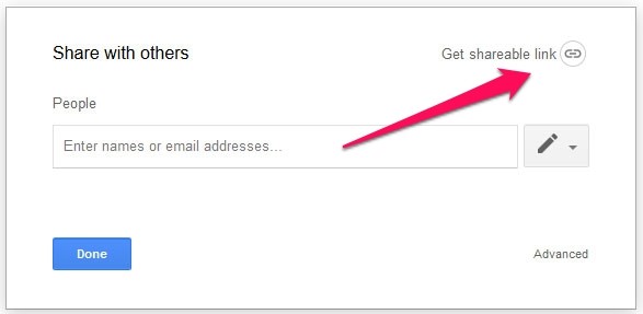
Then, use the drop-down menu to change the setting to can edit.
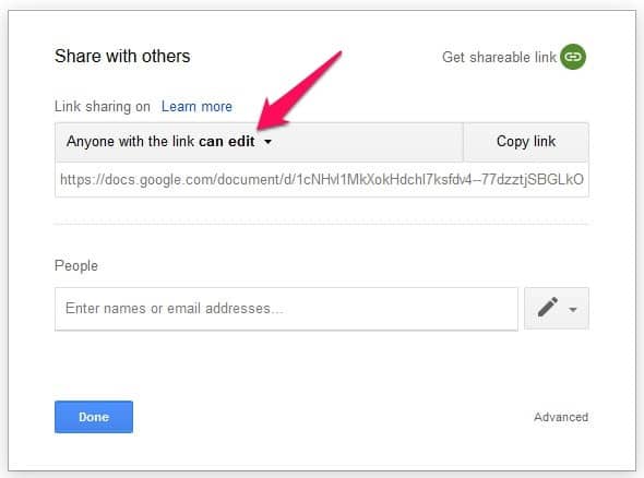
Copy the link and send it to your editor.
7. Thanks for Your Attention!
Thanks for taking the time to go through the entire style guide. Please reach out if anything is unclear or if you have any other questions. Hope to read your content soon!