Web usability is fundamental to the success of any website. If a site is challenging to use, then it will not only be frustrating for users, it will also damage your business.
Users will spend less time on a site they find hard to use and give up before completing your calls to action. They will also remember less of what they read and are considerably less likely to return.
In short, poor website usability is terrible for business. But what can you do about it?
The answer lies in:
- Understanding what makes a website hard to use in the first place.
- Knowing the techniques for improving things.
- Implementing an ongoing program of usability testing throughout the life of the website.
It is these three components that we explore in this post, starting with what makes a website hard to use in the first place.
Table of Contents:
- What makes a website hard to use?
- Start by testing your website usability
- How to improve website usability?
Let’s dig in.
What Makes a Website Hard to Use?
There are three main reasons why somebody finds a website hard to use.
- The first reason is that the site is just confusing. Perhaps it has way too many elements on the screen that the user has to process. Alternatively, there may be lots of distracting animation or imagery. Whatever the case, the user quickly becomes overwhelmed.
- The second reason is that the website is inconsistent with expectations. For example, if I asked you how you would search on a website, the chances are you would go to the top right of the page and type your search query into an input field there before pressing the search button.
However, if the input field wasn’t in the top right or the button was missing, you would immediately be confused because the site didn’t behave as you expected.

- The final reason people struggle with websites is that they simply ask too much of them. Many sites present too many options to the user in one go with long lists of products, countless calls to action, or bloated navigation.
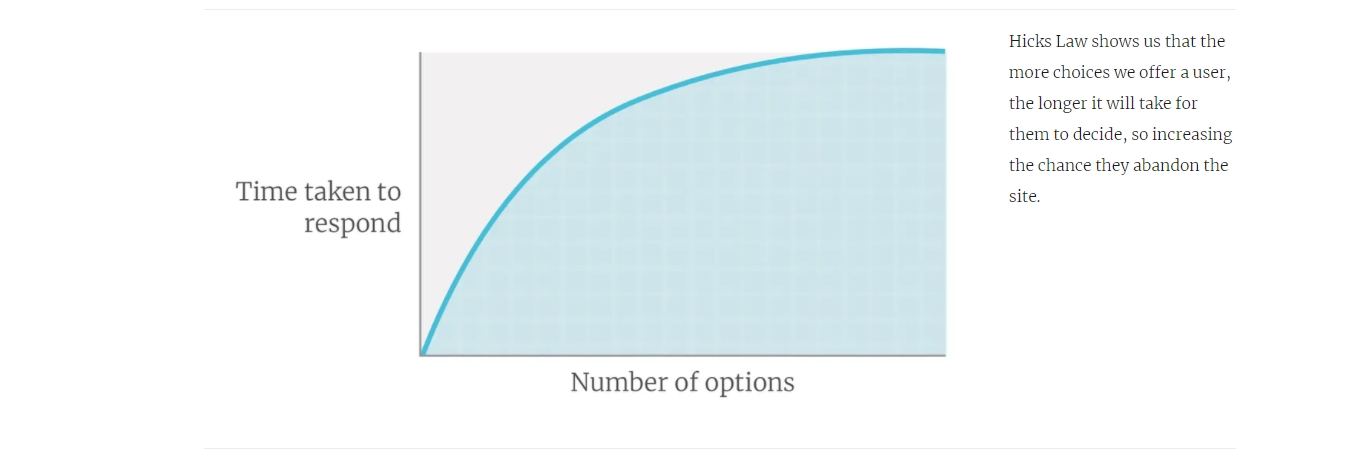
People become overwhelmed, suffering from analysis paralysis when confronted with too many options. In fact, Hicks Law has demonstrated a direct relationship between the number of options and the time it takes to make a choice. That is the time that most users aren’t willing to invest online.
- First, the more familiar we become with something, the more intuitive it becomes. You only need to think back to when you learned to drive to realize that it is true. When people first learn to drive, it is overwhelming with so many different things to consider. However, after you have been driving a few years, it is easy to arrive at your place of work with no memory of the journey, let alone the act of driving.
- Second, when we are looking at our website, we usually are giving it our full attention. However, users rarely are. Think about the way you navigate other websites. You are often surrounded by distractions, whether that is noisy colleagues in the office, or your children demanding attention at home.
Things are even worse on mobile devices, where we are often using them when we are out and about or while doing other activities such as watching TV.
So if we cannot trust our judgment in regards to our website, how do we begin to improve its usability? The answer is that we have to test.
Start By Testing Your Website Usability
Many consider usability testing a luxury they cannot afford. That it is time-consuming and expensive. However, although it certainly can be both, it doesn’t need to be.
For starters, there are many misconceptions around testing. You don’t need to test with many people. Five or six people are ample as more does not uncover significantly more problems. You also don’t necessarily need your real audience. Although it is always better to test with your actual users when it comes to testing usability, most people will struggle with the same challenges. Only when you are working with people with specific needs (like the elderly or children), demographics matter.

There are many simple tests that you can run that can either be done for free or a few dollars at most. What is more, you can often get results back within an hour. You can spend longer than that debating about the right approach when you could have just tested and got a definitive answer.
The best approach is to adopt a “let’s test that” mindset. In other words, whenever you have a decision to make about what strategy to choose, don’t guess, test.
Don’t wait until the end of your website redesign before testing. At that stage, it is too late. If you do find problems, it is too time-consuming and expensive to fix the issue.
When it comes to testing your website’s usability, you can never start testing too early. It is even possible to test using a sketch or a wireframe. However, you should undoubtedly test the design mockup before you build anything.
Whether a sketch, wireframe, or design concept, there are two easy tests you can run with users that will tell you if you are heading in the right direction.
1. Do the First-Click Test
When visiting a website, the first click a user makes may well determine whether they are successful in completing their task.
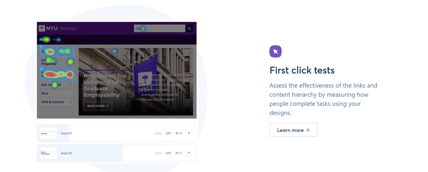
A well-respected study into website usability by Bob Bailey and Cari Wolfson found that if a user got their first click right, they had an 87% chance of completing their task correctly. However, if they get that first click wrong, that drops to 46%.
We can test how likely it is that a user will get their first click right by showing them a design concept and asking what they would click on to complete a specific task we give them.
You can either do this in person or run a survey that you send out to people via email, social media or your website. Also, there are many services that will recruit participants on your behalf for as little as a dollar per person.
If you do decide to run it as a survey, you will need special software that can track where users click on a static image of your website. One good example of this kind of software is Usability Hub. Not only do they allow you to run unfacilitated first click tests, but they also support the second test I would recommend — a five-second test.
2. Run a Five-Second Test
While a first click test helps you to understand how effective your navigation is, a five-second test will test your site’s visual hierarchy. In other words, it enables you to understand whether users see the essential elements on the page.
As the name implies, in a five-second test, you show the user the page for five seconds before hiding it. At this point, you ask the user to recall what they saw.
Note not only what they recalled but the order they repeat those elements back to you. People typically will mention the things that had the most significant impact first. If people struggle to recall your call to action or critical messaging, you know you have a problem that needs fixing.
You can also ask users what they think the website is about. You may be surprised at the replies. Often, what appears obvious to us will not be to your users. It is not unusual for users to completely misunderstand the topic of a website or what your organization offers.
Not that your testing is limited to design concepts. You can test an existing website or prototype too by running usability testing.
3. Lightweight Usability Testing
There are many ways to run usability testing, but for our purposes, I suggest the most lightweight of all the testing options. That will help establish the value of usability testing in your mind and maybe encourage you to get more ambitious in the future.
The type of usability testing I am referring to is known as unfacilitated, remote testing. In other words, you will not be testing in person, and don’t need to be present when the experiment is happening.
To carry out this kind of testing, you need a way to post the test online and record people completing it. Fortunately, there are many tools available such as UserBrain.
Setup is easy. You define a task that you want users to complete on your website and then invite people to complete it.
What you get back is a short video of the user trying to complete your task including an audio commentary where the user explains what they are thinking and why they make the decisions they do on your site.
Once again, tools like UserBrain will often recruit users on your behalf with cost starting at around the $15 mark. However, you can also enlist your participants from friends, family, or colleagues. That said, try and avoid using people from within your company as they will know too much to be good participants.
As you can see, testing doesn’t need to be hard, and if you decide to use a third party to help with recruitment, you often get results back in as little as an hour. As a result, you can test throughout the redesign process and even regularly on your live site too. That is a good idea because the more rounds of testing you carry out, the more problems you will uncover.

That means you will quickly start to find issues with your website that needs fixing. How you address these problems will depend on what they are. However, in the remainder of this article, I want to share with you some common ways that you can help overcome most usability hurdles on your website.
How to Improve Website Usability?
There are many ways that you can improve the usability of your website. However, three areas are worth paying particular attention to. These are:
- The simplicity of your interface.
- The visibility of critical content and calls to action.
- The relevance and clarity of content.
So let’s look at these three in more detail.
1. Simplify Your Interface and Content
In most cases simplifying your user interface and content is the most effective way of improving the usability of your website.
Often websites are stuffed with unnecessary elements such as meaningless stock imagery, secondary navigational links and irrelevant content the user does not care about.
Too often we have the attitude that somebody might find it useful so let’s put it online. The result is that our websites become so cluttered that people cannot find the elements that they are interested in.
Fortunately, you can solve that with a simple three-step process.
Step one is to evaluate every element on a particular page and ask ourselves whether you could remove that element. What negative impact would it have and is that a cost worth paying for a more usable website?
Step two is to look at the remaining screen elements and ask whether any of those elements fulfill a secondary role. Perhaps they cater to the needs of a secondary audience or enable the user to address a less important task.
If that is the case, ask yourself whether you could hide that element so as not to distract people from more important tasks. Could it be hidden more buried in the website or perhaps it could be under a tab or accordion? That means it is still accessible to people but does not complicate the experience for the majority of users.
Finally, it is time to look at what we have left on the page. We need to make some decisions about what we want the user to pay the most attention to.
For example, what is your primary call to action? Is that given significantly more attention than a subsequent action such as “follow us on social media?”
What about content? What order are people likely to see your content in? Will it make sense? Will people see your strapline explaining what you do before they see something less critical like your postal address?
That is where the five-second test can come in handy. It will help you discover if you have got the visual hierarchy of a page right.
Of course, to judge if you have things right, you need a clear idea in your head of what elements are most important on the page.
One way of doing that is to assign attention points to elements. Give yourself 25 attention points. Every page element has to have at least one point, but if you want people to give more attention to one thing over another, it has to have more points. So, for example, your primary call to action might have six points, while the privacy policy would have one.
Once you have done that, you can design the page to mirror those relative priorities. That raises the question of how you design a page to ensure you draw attention to the right elements.
2. Design for Maximum Visibility
There are many techniques that designers use to draw the user’s attention to more essential screen elements like straplines or calls to action. However, there are five that prove particularly powerful. These are:
- Position.
- Imagery.
- Negative Space.
- Colour.
- Size.
3. Consider Position
Because of how we read web pages and how we expect them to behave, some positions on a page are more likely to draw attention than others.
For example, because in the west we read left to right, we favor the left of pages. We have also learned that on most websites, the right-hand column tends to have secondary content in it. Together these two factors mean placing valuable content in the right-hand column reduces the likelihood of the user seeing it.
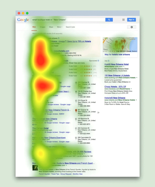
Users also tend to pay more attention to content higher on the page, so if you want people to spot something, it is often better to place it near the top.
However, timing is also essential. If you want somebody to sign up for your newsletter, for example, it may be better to put that call to action lower on the page once they have had the opportunity to assess the quality of your content.
That is why I advise testing when it comes to knowing whether best to position elements. Yes, as a general rule of thumb, placing a call to action high on the page and either on the left or center will prove best. However, there are many exceptions, not least of which is the influence of imagery.
4. Use Imagery With Care
Imagery has a powerful pull on our attention. Our eyes are drawn to imagery and particularly so if the image contains a face. We are biologically programmed to pay attention to people.
That can be a help or hindrance to the usability of your site, depending on how you use images.
For example, it is easy for a user’s attention to skip over a call to action if there is a nearby image to draw their attention instead.

However, we can also use an image to draw the users’ attention. For example, we tend to follow the eye line of faces we see in pictures. If the person is looking at your call to action or some other critical piece of content, then we are more likely to spot it.

Not that it is only an eye line that we tend to follow. We can use arrows or directional lines to draw attention to or away from other content.
Also, the relative distance between a critical piece of content and associated imagery will impact what people see. When two elements are close together, they tend to be associated with one another. So an image right next to a call to action will usually draw our attention to that call to action.

The relationship between elements can help in another way too. It can allow us to use negative space in our favor.
5. Make Use of Negative Space
I am sure you have seen Where’s Wally in the past. What makes it so hard to spot Wally is not that the character is particularly camouflaged. In fact, he has a bright and distinctive outfit. He is hard to see because he is surrounded by so many elements on the page, competing for our attention.
We have already talked about stripping back the number of elements competing for our attention on a page. But another technique we can use is to surround our critical content with space. Without anything else to latch onto in the vicinity, our eye will focus on that piece of content instead. It is the same reason we will see the smallest mark on a white wall.

Not that negative space is the only way of making your critical content stand out from other elements. We can use the colour as well.
6. Enhance With Colour
We all know how birds and flowers use bright contrasting colors to stand out from their surroundings. We can use the same technique on our websites, by reserving a different color exclusively for critical content such as our calls to action.
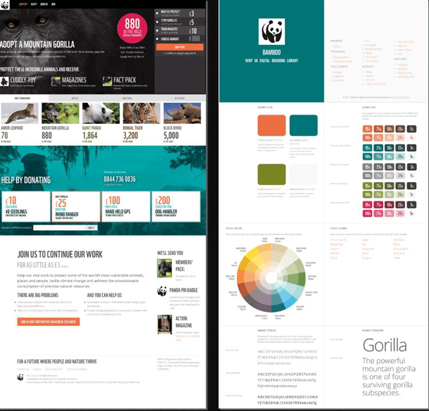
However, we need to be careful not to rely solely on color because we all see it slightly differently.
That said, color can be a powerful tool in drawing attention when combined with other techniques, such as using size to our advantage.
7. Utilize Relative Size
One way we judge the relative importance of elements is by size. We instinctively know that a big call to action button is more important than the tiny link to the privacy policy.
However, it is not so much size itself that matters as the relative sizes between items. If everything is large, then nothing is. Everything has equal importance in people’s minds.
Also, the more significant the difference between element sizes, the more the distinction is made between them. So the contrast between our privacy policy and primary call to action is obvious.
However, too often the relative size between elements on a website is not large enough, and so the distinction is not apparent enough to make a difference.
As you can see, the design is a powerful tool for drawing attention, but we also need to consider the content on our site.
8. Consider the User When Creating Content
The primary problem with the content on websites is that we do not create it with the user in mind. We start from the premise of “what do we want to say about ourselves.” Instead, we should ask “what does the user want to know.”
That means, from a usability perspective, we must put the right information in front of users at the right time.
9. Don’t Make the User Search for Answers
Too often users have to hunt for the information they need. For example, imagine you are signing up for a newsletter. Just before you do, a whole load of questions goes through your mind about whether they will spam you or how secure your email address will be. However, all too often, you would have to search for answers in some privacy policy buried deep in the website. Instead, we should be answering those questions in the design of our newsletter signup form.

Not that this is the only problem with how we approach content. We also have a habit of structuring content around our view of the world. We forget that the user sees the world differently.
10. Match the Users Mental Model
We each have a mental model of the world. That influences how we see the world and the connections we make between concepts or things.
The problem is that the more specialized we become, the more our mental model differs from those around us. For example, if I asked you what you would be doing if you went to the bank, you would probably think of some kind of financial transaction. However, were I to ask the same question as a professional angler, they may well think of a riverbank.
These differing mental models can be a big challenge when creating your site structure because your mental model is probably very different from your audience. You are a specialist in your subject matter and so the way you view the world will be different from your users.
That is why we need to either involve the user in the creation of the site structure, using a technique like card sorting, or at least test any information architecture we come up with.
The other problem you may encounter with your information architecture is the number of navigational items you display.
11. Limit Options and Make Them Distinct
A significant usability hurdle on many websites is the complexity of navigation. Many sites simply have too many elements on each level of their navigation. That is a problem for two reasons.
- First, we are terrible at holding a lot of information in our short-term memory. We can typically hold about four elements at a time, which is why your credit card number is grouped into four groups of four digits.
- Second, the more navigational elements we have, the more likely they are to be similar. When options are not distinct from one another, users become unsure and are more likely to make mistakes.

As a result, we should limit the number of options we show users at any one time and make sure each option is as distinct and clearly labeled as possible. That applies whether you are talking about navigational items, eCommerce product categories, or calls to action.
Continue Improving Your Web Usability
Website usability is an enormous and complicated subject. However, it is easy to start, and it will make a significant difference with only a small amount of effort.
Not only will you end up with happier users, but you will also see improvements in conversion rates and the number of return visitors, not to mention word-of-mouth recommendations.
0 comments